|
|
|||||||||||||||||||||||||||||||||||
|
Logos, heralds, timetables and paint schemes pretty much changed together, so they will be described together. Herald – something that precedes and indicates the approach of
something or someone For purposes of this information, logos will refer to the symbols used to identify the LIRR as a company that were used on printed and promotional material (timetables, brochures, tickets). Heralds will refer to those symbols when applied to rolling stock. For the most part though, they are interchangeable. These symbols changed along with changes in ownership and management, and with the arrival of new equipment. In
the early years of the LIRR and up until the 1920s, there was no herald or
logo being used. Printed
material had the name in various forms of script.
The
Pennsy years brought the keystone logo, appearing in early LIRR ads from
1917 (Info: Art Huneke), February
1924 on the Long Island Information Bulletin, and the May 14, 1924 timetable.
DD1 #348 at Montauk Cutoff view N LI City 03/26/1949 (Faxon-Keller) This was used as a herald only on the DD-1 electric locos after the pin-striping of 1939. Prior to the pin-striping the logo was not utilized. Research: Dave Keller
Except
for special name trains, steam locomotives only had “ When
the first diesels arrived, they only had “ The
Tichy colors were applied to passenger cars as well, with MP54 electric
coach #1901 being the first to wear them.
According to the December 1949 issue of the employee magazine, Long
Island Railroader, these colors consisted of a bright aluminum color
roof, slate gray body, and dark green underbody.
“Lettering is in aluminum, and numerals are in red against an
aluminum background.” On
the RS-1s, “the engine number has been repeated in large silhouetted
aluminum numerals mounted in a blue frame on either side of the head
end,” and had red pilots and black cab roof.
The C-Liners differed slightly, with the engine number appearing on
the nose in a “battleship” style with a shadow effect.
Also, the roof was an aluminum color like on the coaches.
The H16-44s had slate gray applied on the body and roof, with red
pilots.
This
herald was not used as a logo on printed material.
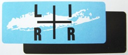
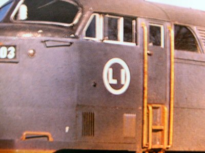
At that time the logo was the “circle LI,” first appearing on
train crew uniforms in the form of a lapel pin.
This was described in the October 1949
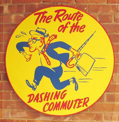
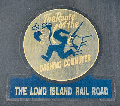
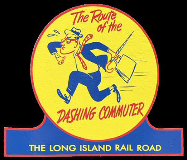
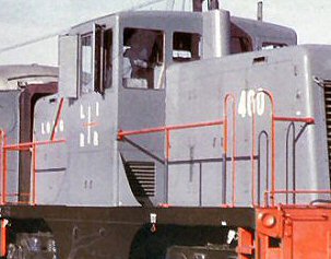
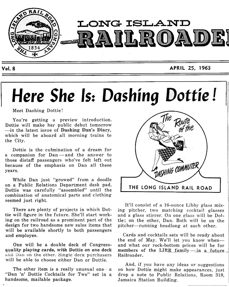
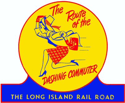
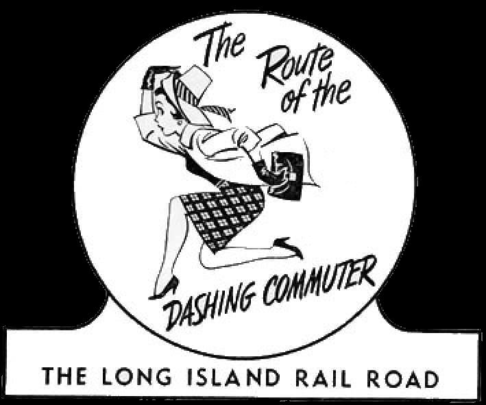
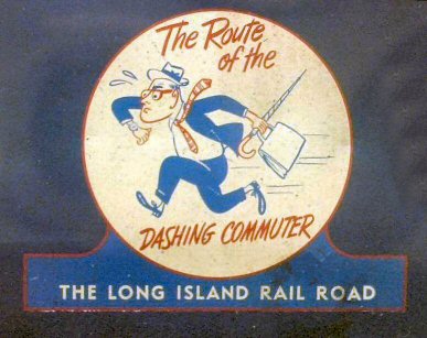
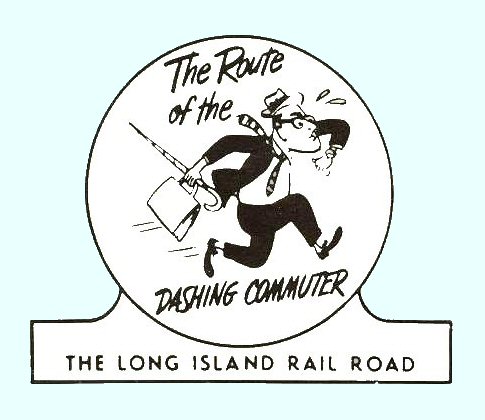
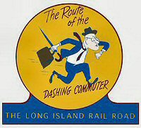
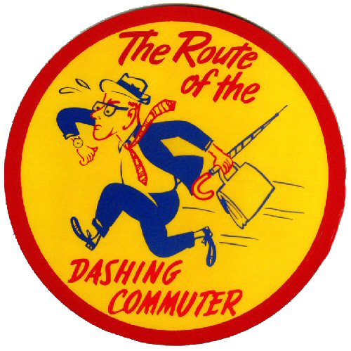
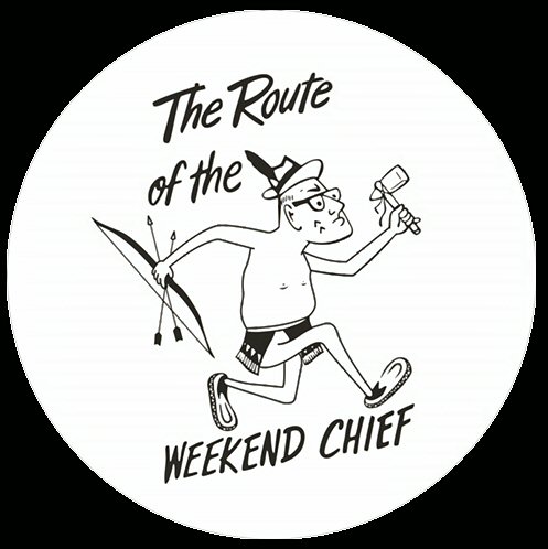
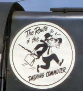
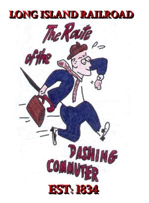
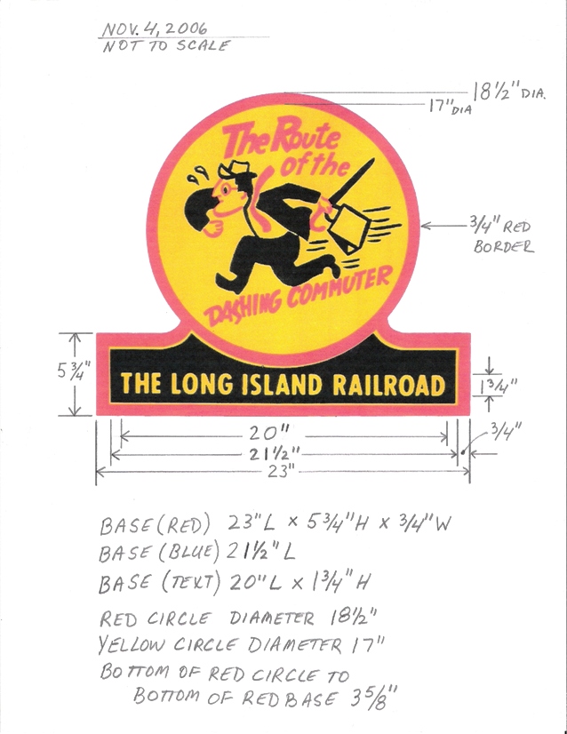
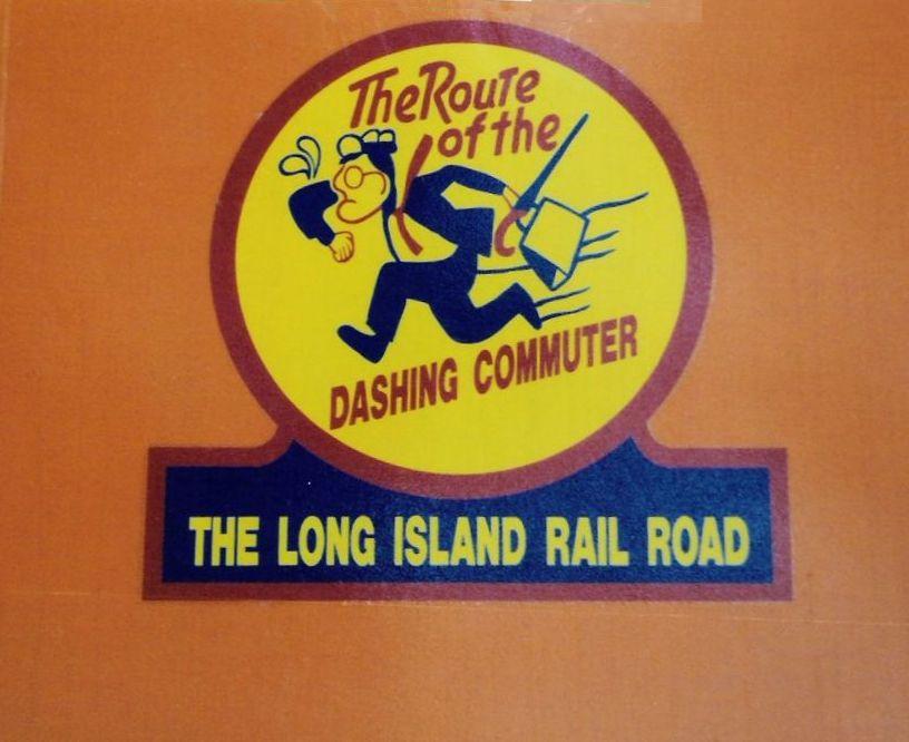
The FM C-Liners were the only locos to receive the new colors and herald. The herald was applied to each side of the unit at the front and rear. In addition, the herald was applied to wreck crane #W50 and possibly other equipment. Starting in 1955 with the arrival of the new Alco RS-3 diesels to replace the last of the steam locomotives, the “Goodfellow colors” (as they are often referred to) came into use. These colors were a smoke gray body and orange ends and pilots. This scheme was applied to all diesels as they went into the shop for maintenance and repainting, and was completed by 1959 when the Dashing Dan herald started appearing. The first timetable to have Dan was in September 1959, although he was introduced in the April 1957 Long Island Railroader. The original Dashing Dan with base and running to the left.
The S1 or S2 never had the larger, baseless
Dashing Dan beneath its number of the cab. I am positive of this, with all
the switcher photos I have in my collection; there must be 60 or 70. The
paint scheme went like this: No Dan, then Dan with a base, and then no Dan
before the MTA blue and yellow era. The
arrival of the new Alco C420s in late 1963 brought another change in color
scheme and herald. The C420s
had the same orange and gray colors, but the orange was applied in a
“funnel,” “sweep,” or “wave” pattern on the hood sides.
This scheme is often referred to as the “sweep” or “World’s
Fair” image (the C420s arrived the same year the All baseless Dashing Dan logos on RS1's, RS2's and RS3's were placed in the orange "wave", unlike the C420's, which had baseless Dan in the gray area behind the cab on the short hood. This Dan was added later to some units as I have seen a few photos of Centuries with no Dan. Research:
As far as timetables are concerned, the last one to have Dashing Dan was the October 15, 1968 listing, followed by the first with the MTA logo effective November 25, 1968. And this brings the LIRR to the MTA years. On January 1, 1965, the Metropolitan Commuter Transportation Authority was created by New York State Law. The MCTA bought the LIRR from the PRR in 1966 for $65 million. This agency was short lived as the Metropolitan Transportation Authority was created on March 1, 1968. This new ownership brought about another change in colors and heralds. The
delivery of the second order of eight C420s (classed L2 by the Railroad)
in 1968 had them in New York
The
LIRR is nothing without the variety it gives.
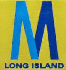
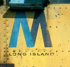
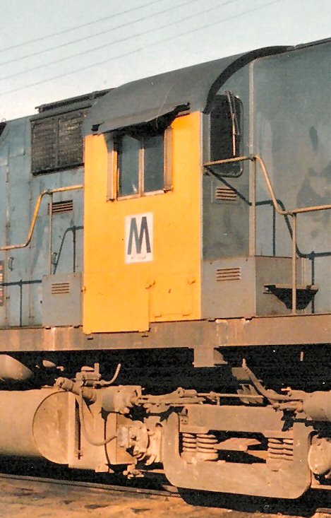
The “M” herald had the words “
The MTA “M” herald appeared into the early 1990s and could be found in small and large versions on locomotives. On the Alco road units and switchers in the MTA yellow and blue scheme, the “M” was on the cab side below the window. The power packs (Alco FA1 and FA2 units) wore the “M” on each side of the nose under the number boards; that is, if it was even applied to a particular unit. A third, little used version has the smaller “M” on a silver square. This also was placed on the side of the cab below the window. Photos show this on several C420s (215, 224, 226 and 229) and at least one RS3 (1552). C420 #224 had this applied in January 1976 when it was painted in the new blue and white “wave” scheme to match the new EMD GP38-2s.
The
GP38-2s arrived in the aforementioned blue and white “wave” scheme in
1976. This was inspired by
that used by the GP38-2
#252 was designated the bicentennial unit to honor our nation’s 200th
birthday. It had the middle
stripe in red instead of blue, and on the cab side under the window was a
special bicentennial commemoration herald.
The LIRR shop forces later would apply this to the other geeps and
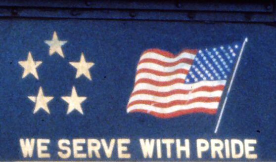
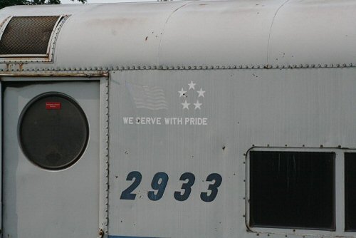
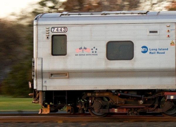
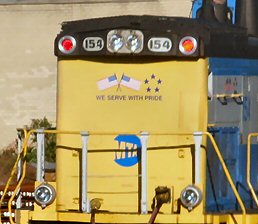
L2s. Starting in late 1979, the geeps and L2s also received the red stripe. The president of the LIRR at that time was Francis Gabreski, a World War II Ace. With his tenure, a degree of patriotism came about the Railroad regarding various markings. These included naming snow-fighting equipment after WWII aircraft (such as Thunderbolt). It also brought about the use of the American flag, an arrangement of five stars, and the slogan, “We Serve With Pride” on rolling stock. These three graphics usually were used together, but sometimes appeared in any combination. And these are still used today.
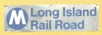
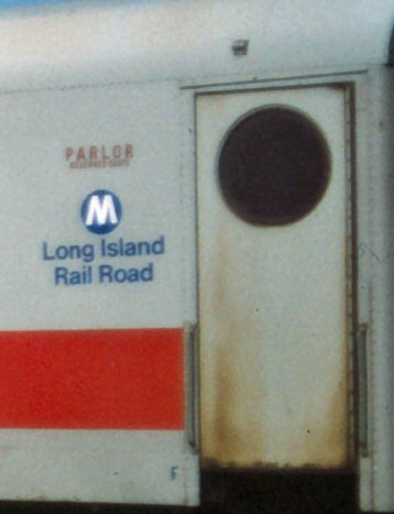
The
1988 Annual Report has the “circle M” on the back cover.
This was a white “M” on a blue circle.
It later appeared as a new herald in March 1991 with the words “
|
|||||||||||||||||||||||||||||||||||
| LIRR DASHING DAN | |||||||||||||||||||||||||||||||||||
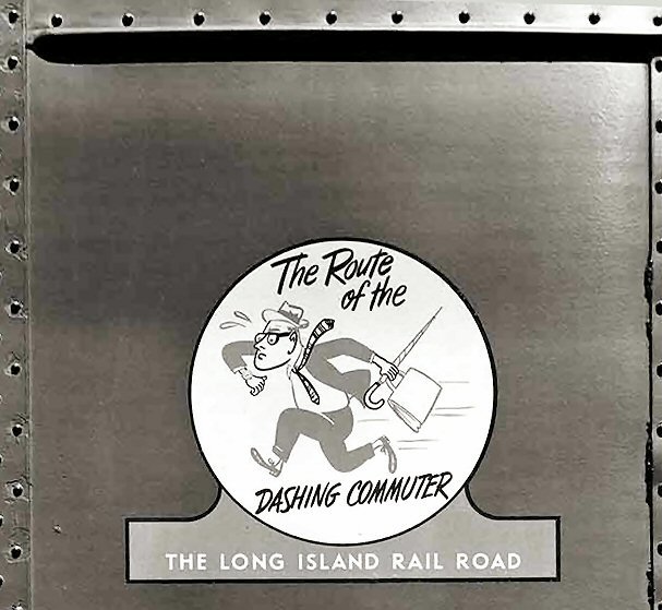 "Dashing Dan" herald c.1959+ Photo: Dom Wood |
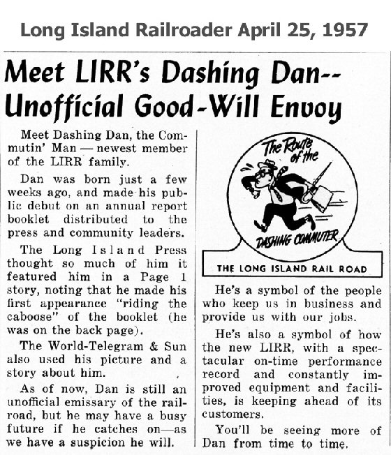 Long Island Railroader (employee news letter) introducing "Dashing Dan." April 25, 1957 Archive: Dave Morrison
|
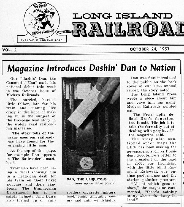 Long Island Railroader "Modern Railroads Intro" October 24, 1957 Archive: Dave Morrison  Long Island Railroader "First Car to get Decal" LIRR Pres. Goodfellow looks on. February 2, 1959 Archive: Dave Morrison |
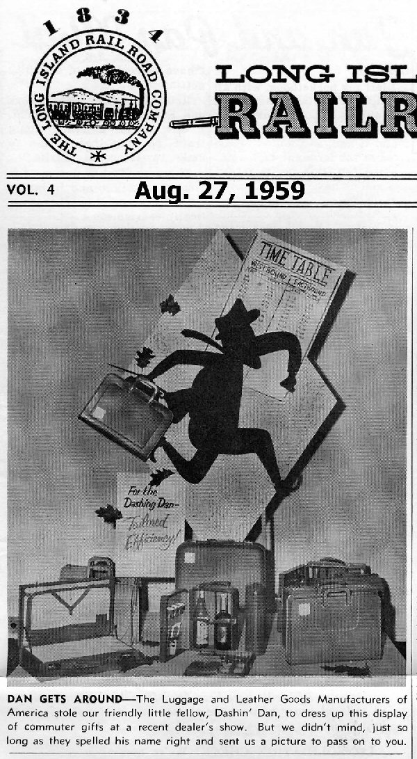 Long Island Railroader "Dan Gets Around" August 27, 1959 Archive: Dave Morrison |
||||||||||||||||||||||||||||||||
 "LIRR's Dashing Ideas" Newsday February 6, 1963 Archive: Dave Morrison |
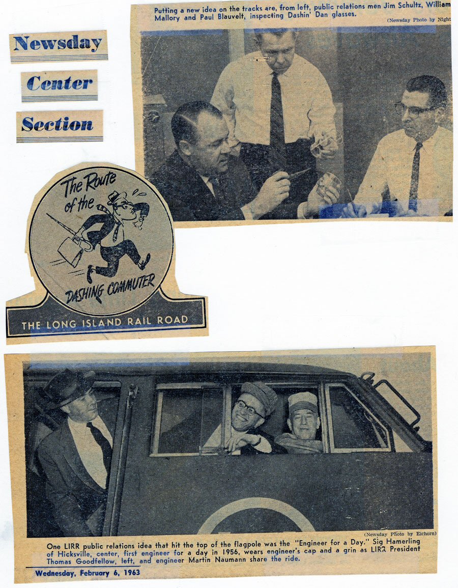 "LIRR's Dashing Ideas" Photos Archive: Dave Morrison |
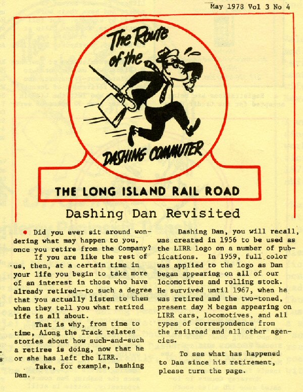 May 1978 issue of "Along The Track" (formerly the Long Island Railroader) Archive: Dave Morrison |
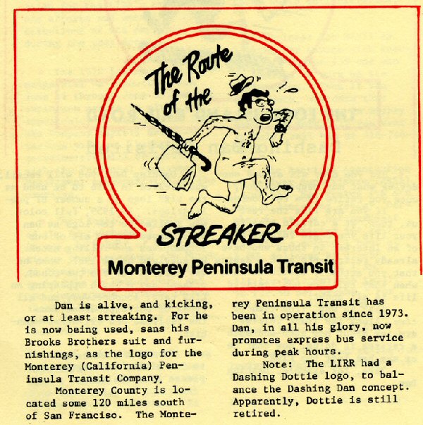 May 1978 issue of "Along The Track" Page Two Archive: Dave Morrison |
||||||||||||||||||||||||||||||||
 Photos/Archive: Suzanne Parker |
Photos/Archive: Suzanne Parker |
|
|
||||||||||||||||||||||||||||||||
|
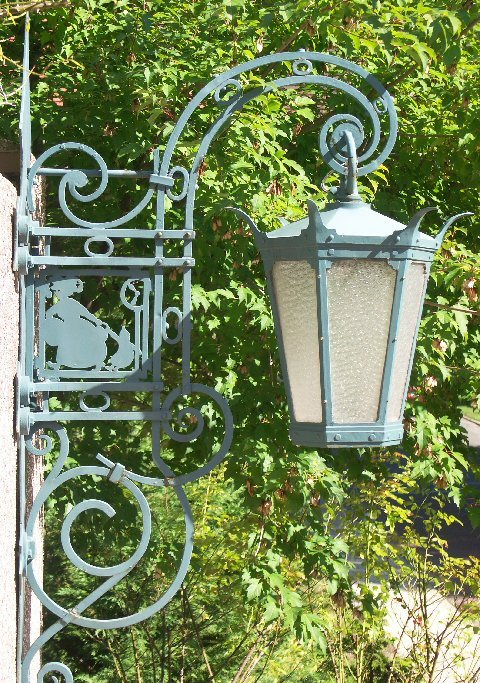
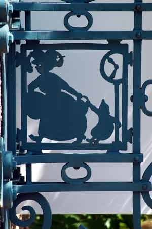
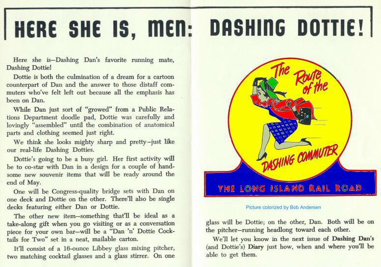
This lantern of a mother dragging a recalcitrant child is opposite the Dashing Dan lantern above the entrance stairs to the Forest Hills Station. Maybe the child in question grew up to be Dashing Dottie ;-) All the lanterns on the station and throughout Forest Hills Gardens were designed by Grosvenor
Atterbury, the architect who designed the station, the Forest Hills Inn, and most of the original houses in the Gardens. Info: Suzanne Parker |
|||||||||||||||||||||||||||||||||||
|
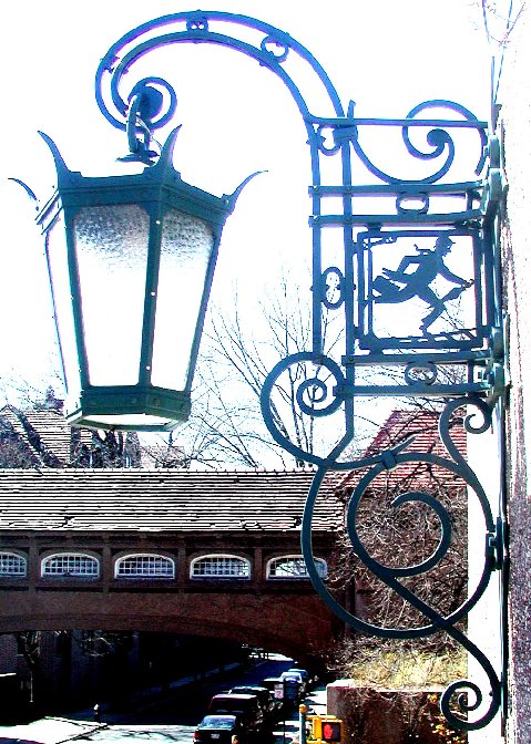
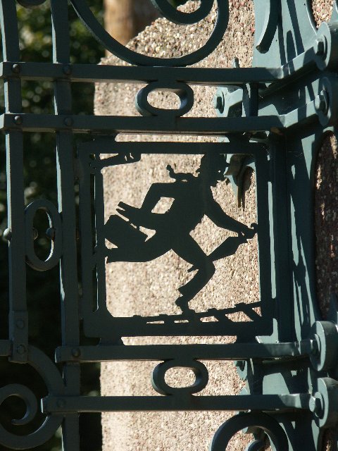
Forest Hills Station decorative ironwork that has been at the station since the station opening in
1911 looks very similar to Dashing Dan. It looks at though Dashing Dan was born
here. In 1957 the logo started appearing on LIRR locomotives, cars and other equipment. Info: Dave Morrision
Long Island Railroader Magazine, Dan first made his "official" appearance to the public on the back cover of the 1956 LIRR Annual Report. Info: Dave Keller RMLI has an account of a man who visited them & said he was the inspiration. Maybe the artist used both for the final design. See below "The View from Greenport" Info: Al Castelli
|
|||||||||||||||||||||||||||||||||||
 RMLI's
Greenport Museum RMLI's
Greenport Museum"The View from Greenport" Don Fisher 08/2003 Winter Edition RMLI PostBoy
|
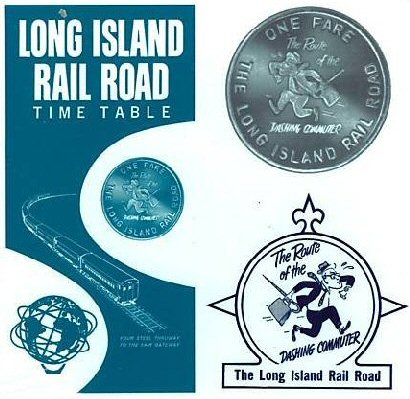 World's
Fair Dashing Dan Token on timetable 1964 World's
Fair Dashing Dan Token on timetable 1964
|
||||||||||||||||||||||||||||||||||
|
"On
the Long Island Rail Road . . . BooooaRD!" |
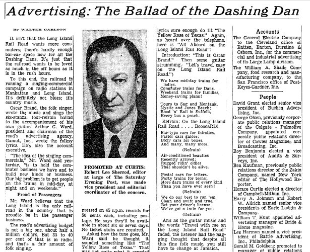
From the Long Island Rail Road’s publication “Parlor
Car East” by Oscar Brand. He sang them for the LIRR.
The tune is an old folk song titled "Wait For The Wagon."
We have mid-day trains for Ladies, Commuter trains for Dans, Weekend trains for families, Money-saving plans! Tours to Sag and Montauk, Mystic and Jones Beach; Road ‘n’ Rail in Suffolk, Every bus a peach. Bar-type cars for thirsties, Parlor cars galore; Boxy-cars for boxes, And many, many more. Air-conditioned beauties Recently arrived; Rugged-ridin’ oldies That shouldn’t be alive. Diesels and Electrics, Party trains for teens; More darn trains of every kind Than you have ever seen! We do our best to run ‘em Clean and swift and true. Bet your driver’s license We’ve got a train for you! Info provided by: Dave Keller |
||||||||||||||||||||||||||||||||||
|
* A cudgel (club that is used as a weapon) made of hardwood (usually oak or blackthorn wood) believed to be magical tool corresponding with the staff. Info: Steve Lynch |
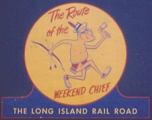
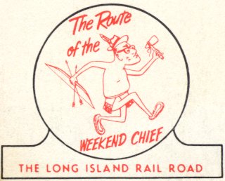
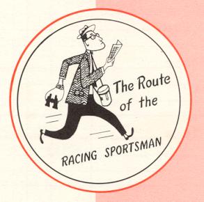 Dashing
Dan Racing Sportsman Dashing
Dan Racing Sportsman1966 |
||||||||||||||||||||||||||||||||||
|
|
|
||||||||||||||||||||||||||||||||||
|
|
 LIRR Harold Protect Engine #118 12/25/2003
 Photo: Bob Andersen |
||||||||||||||||||||||||||||||||||
 Introducing LILCO Lil' - LIRRer 6/20/1957 |
 Dashing Dan decal by John Turkeli
applied to the LIRR ALCO FA1 Cab Unit at OBRM 7/09/2023 Dashing Dan decal by John Turkeli
applied to the LIRR ALCO FA1 Cab Unit at OBRM 7/09/2023 |
||||||||||||||||||||||||||||||||||
  |
 |
||||||||||||||||||||||||||||||||||
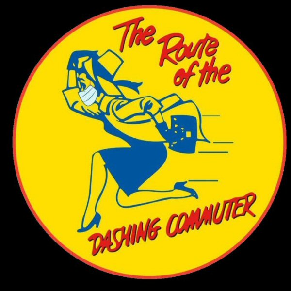
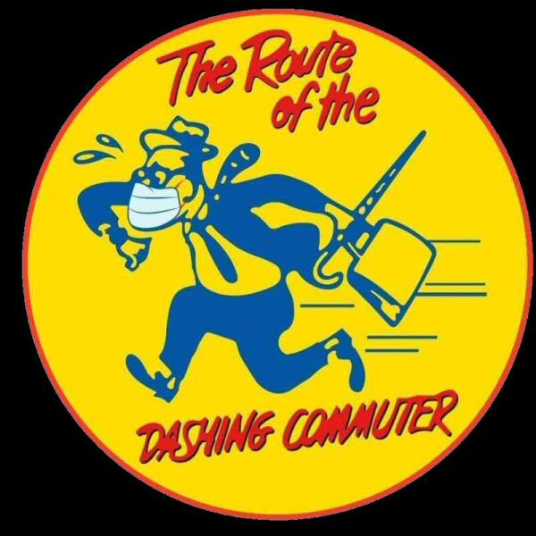
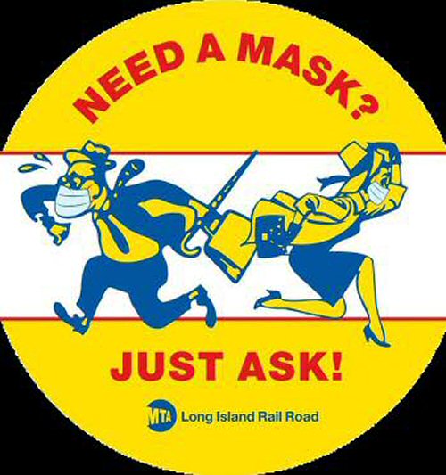
| Dashing Dan and Dashing Dottie with 2020 COVID19 masks! Archive: LIRR/MTA | |||||||||||||||||||||||||||||||||||
|
Commentary and photo documentation provided by: Al Castelli, unless otherwise noted. |
|||||||||||||||||||||||||||||||||||
 LIRR
Symbols, Logos & Heralds
LIRR
Symbols, Logos & Heralds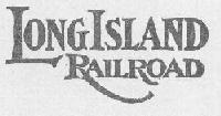 For example, this logo appeared on the top of all public timetables
from c. 1900 up to and including the 'teens. (info: Dave Keller) Rolling stock generally had “Long Island” or the company initials.
For example, this logo appeared on the top of all public timetables
from c. 1900 up to and including the 'teens. (info: Dave Keller) Rolling stock generally had “Long Island” or the company initials.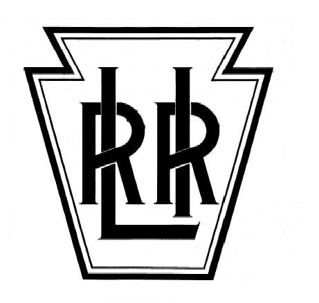
.jpg)